Anyone can make mistakes when it comes to re-modeling. Would you believe even the Millennium Biltmore is guilty of this. We’ll see an example of it in a minute.
But let’s start with what they did right…
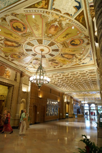
Here we have the lobby – spacious, colorful, and well lit.
It’s what you’d expect from a hotel with the Biltmore name in it. Imagine my excitement when I learned this was the location of my design leadership conference!
I eagerly Googled the hotel to check the decor. Here’s the description of type or room I would use…
…the Standard Room accommodations are anything but standard, with each featuring a rich, warm color scheme and luxurious marble bathroom. Each is of a distinct size and shape, reflecting the unique heritage and history of the Millennium Biltmore Los Angeles Hotel. Ranging from 250-500 square feet, each room is equipped with a variety of thoughtful features, including high-speed internet access.
I was tickled pink to read this, and see the pictures.
The lobby was just as expected. The room was beautiful. But my bathroom….
Well, let’s just say it was a surprise.
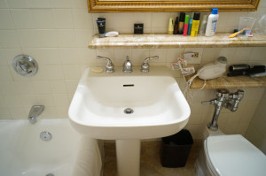
What’s wrong with this picture?
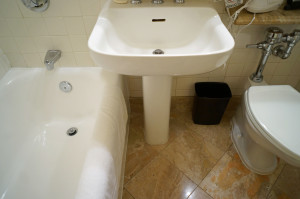
If you said the sink and tub overlap…you’d be correct!
Now — what are the six other problems?
I’ll tell you in a minute…but first…let’s talk about the best way to approach a project.
Remember — what you do before you start your project is the most important part. It’s especially crucial when you have limited space.
Because this bathroom is small, yet needs certain fixtures, some overlap may not have been avoidable.
The picture is a little drastic, and we have to remember this building is over 90 years old. The fact that space is so limited means every detail, no matter how small, needed to be carefully planned.
Sinks, toilets, and bath or shower facilities are required. Here, the lack of space meant cramming shelves in a narrow space to replace countertops. (Are you seeing the other problems now?)
Overlooking any detail, no matter how small, can throw off the harmony of a room. What’s worse, it may not fix an existing problem, or could create a new one.
Let’s go back to our picture…
The poor planning is obvious. In fact, it’s loaded with problems that go beyond the sink and bath.
Look at the floor. The tile is pretty…and angled for style. But the reflected light shows how smooth it is. Imagine a puddle of water…and stepping into it. Even moisture from the sink or tub makes it as slippery as black ice.
Third, the shelf is too close to the toilet. It limits access to the toilet handle…and just barely has enough room to accommodate the seat cover all the way back.
The fourth problem is having a hair dryer on the shelf so close to the sink. Talk about a shock!
Fifth…the wastebasket, tucked under the sink, forces the user to bend over to throw things away.
Finally, and most important, it’s crowded. There’s little space to maneuver, especially for ones needing assistance. Even a person using one crutch would struggle to get around. This bathroom is an injury waiting to happen, and useless for anyone with a handicap, even a temporary one like a sprained ankle or broken leg.
We assume the hotel paid well for these renovations, but sadly, the money on this bathroom was poorly spent. Don’t let this happen to you in your home.
What your home says about you.
Your home is the backdrop of your life. Every well-conceived detail and execution reflects your good taste.
I help my clients realize their vision while improving the safety of their environment. I never get tired of their excitement when they see how safety and beauty meld together. If you’re thinking of a change, call me at 480-695-1360. There’s never a charge for a phone call!
Live easy,
~Jeanette.


