How bathroom art inspired the colors on Mesa’s Main Street.
There’s a little bit of artist in all of us. I know this because most of the ideas for my interior design work come from my clients. I love helping them realize just how creative they are.
Seeds of ideas sprout from many sources, even unusual ones. (Did you know Michelangelo was inspired by brothels for some of his Sistine Chapel figures?)
Think about how you react to things or places. Did you feel a flood of warmth…a tingle of excitement? Did something make you stop and stare? Sometimes one glimpse provides the answer to a dilemma. Its how a bathroom trip in the mountains led to coloring the columns on Main Street in Mesa.
Here’s how…
Mesa’s Downtown Association hired me to do a color consultation for the colonnades lining the stores along Main Street. They wanted an atmosphere to draw and keep people lingering in the area after a meal or show at the Arts Center.
Bright, festive colors create a sense of fun and enhance socialization…
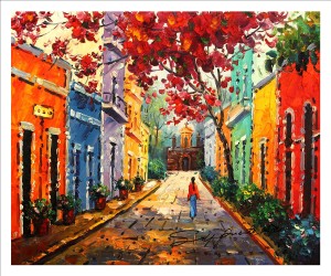
So I went on-line for pictures of the Caribbean, like Cuba and the Bahamas. I showed them three pictures and they chose one of a woman walking down a cobbled street between purple, blue, orange, and green houses.
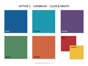
These shades created the first color palette.
There’s just one problem.
Seaside colors reflect the sparkle of the ocean, but they’re too bright for the desert.
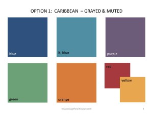
So I made a second palette with the same colors, just toned down with a little gray. We did a ‘field trip’ by taking both palettes downtown. The second palette was still colorful, but a better fit.
Yet something was still gnawing at me. I knew the second palette would work, but felt it could be better.
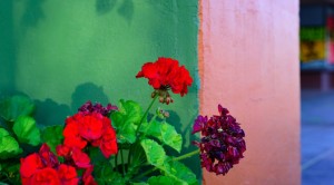
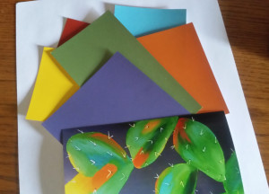
It was up in Alpine, at a small restaurant, where I found the answer. Hanging in the bathroom was a painting of a prickly pear cactus. It was perfect with all the colors we’d discussed, but in the right tone. I took a picture and created a third palette.
As planned, I presented the picture and the first two palettes. Heads started to nod as the second palette came up. Then I told them I had a bonus.
The surprised looks on the faces of those I’d been working with were fun to see. They had no idea there was a third option.
First, I showed them the picture of the cactus and explained how the colors would bring out the best for downtown. Then I showed them the palette.
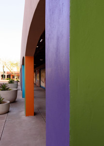
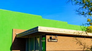
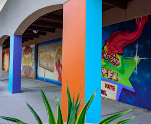
The decision was unanimous – everyone wanted the bonus color palette! Once settled, I enjoyed explaining how the inspiration came about. As you can see, these colors accomplish the goal – in the right tone.
Blue Toile & Burnt Caramel
Inspiration is a function of awareness. It can happen anywhere, any time. Its why, when I work with a client, I tell them to take a picture every time something captures their attention. When you notice something, it means it’s speaking to you.
It doesn’t matter whether you’re doing a project or not, if you see something that makes you take a second look, get out the phone. (Isn’t the camera option wonderful?)
You never know when a spontaneous shot will inspire your next home project!
Live easy,
~Jeanette

