photo by paul hanaoka on unsplash
There’s a difference between having lots of space and making good use of the space you have.
As you’ll see in the following example, my clients had one large area shared by the kitchen, dining and family areas. Yes, there was plenty of room, yet much of it was unused or “dead zone.” The lack of definition is what caused each room to feel smaller.
The answer was to add a kitchen island.
Really?
Yes – adding a kitchen island actually created more space!
My clients are DIYers, a do-it-yourself family, who wanted to expand what felt like a “one-person” kitchen. They had very little countertop surface and minimal cabinet storage. They knew they had the floor space to make it bigger; they just didn’t know how to go about it.
Here’s the problem.
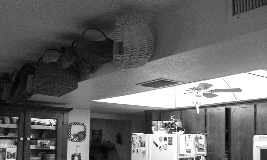
Back in the 1970s-80s (when this home was built) it was popular to hide heating and cooling vents in lowered ceilings. That’s what the builder did here. Along with housing florescent lighting, the lower ceiling was meant to “separate” the kitchen from the other rooms. Unfortunately, it formed an invisible barrier. Virtually all the appliances…with countertops and cabinets squeezed between them…were pressed along the outside walls. This arrangement stifled any kind of work flow and wasted a lot of space.
(I have to admit, I love it when builders do things like this. It makes my job so much more fun!)

It was time to “push back!”
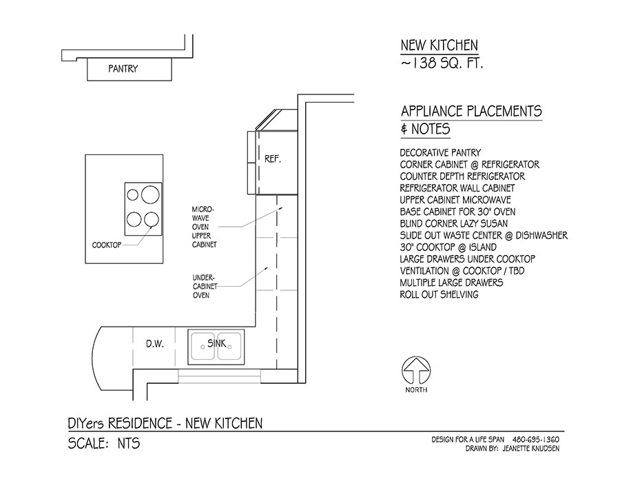
I started with raising the ceiling to match the height of the adjoining rooms. Although it required moving the vents further up into the ceiling, this step alone removed that “invisible barrier.” Next, I added a kitchen island to do three things: increase countertop space, increase cabinet storage, and move the range-top stove away from the wall. The island fills in space that was previously a dead zone, plus it defines the lines between the kitchen and other rooms.
Moving the range to the island opened up countertop space around the remaining appliances. These adjustments make it possible for the family to prepare meals together without feeling like bumper cars. Using the original home’s footprint, I increased the kitchen from 111 to 138 square feet…without “shrinking” the other rooms.

One of the bonuses of good design is adding warmth and beauty. In this case, we transformed a narrow, “half-galley” style kitchen into one that invites people to come in and visit. By the same token, the island defines the other two rooms and makes them feel larger. All this happened without losing that open, airy feeling.
And there’s more. In my next blog you’ll see how I added even more storage and created a workflow triangle so the kitchen is truly a multi-person room.
Live easy,
~Jeanette
Related Articles:
What is Universal Design? It’s Design For EVERYONE!
TOE TAG HOMES – What ARE They?

